crafting a Mute Button for kids
2016 | UI Design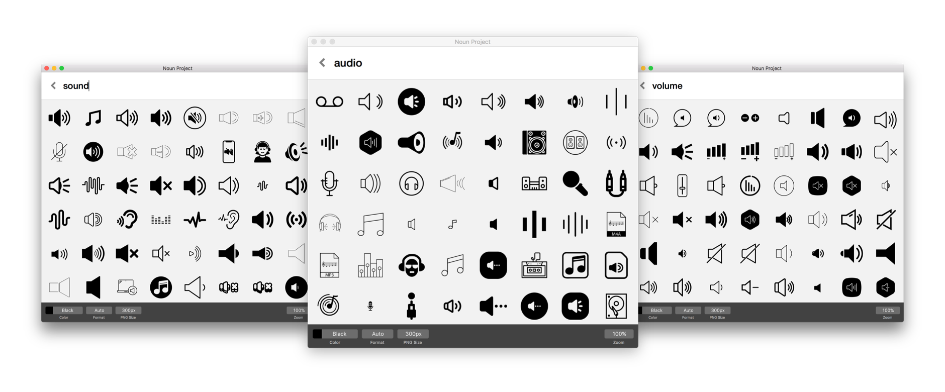
It’s usually smart to reuse established patterns in usability, but while designing children’s games, I began to interrogate established iconography more critically.
5-year-olds don’t have years of exposure to common symbols and their obsolete analog histories. The quintessential example is the floppy disk "save" icon (💾); plenty of designers push to redesign it, but I side with Justas at Icon Utopia:
“A Settings gear (⚙️), folders (📁), etc. There are tons of objects you would rarely see in the real world these days. But they still make great icons. People learn icon meanings[…]and the physical object isn’t even important anymore.”
As long as the icon was interpreted as intended for my use cases, I defaulted to using standard icons.
That is, until I observed the mute button in the hands of kindergartners.
Discovering the problem
My team discovered that kids had trouble with mute controls for self-directed math lessons. If students got annoyed with the script or repeated instructions, we expected them to click on a standard mute icon on the screen. Instead, they unplugged their headphones, missing any subsequent instructions.
This kind of user error doesn’t appear in data, but can devastate actual learning results. We needed to improve the controls and effectively communicate the following states:
Audio can be turned on and off at will
Audio is playing, in case student doesn't hear it
Audio can be replayed if student needs help
DISCLAIMERClient names and other information have been redacted and obfuscated to comply with my non-disclosure agreement. Opinions and analyses in this case study are my own and do not necessarily reflect the views of my past employers.
tl;drI researched and designed interface controls for young schoolchildren using digital education tools. The mute button is one curated case.
TeamLen Yeh, Product Design
Tucker Fross, Product Management
This kind of user error doesn’t appear in data, but can devastate actual learning results.
Exploration
We started by exploring common representations of sound, audio, and other synonyms*. Most of it was expected: too metaphorical, visually elaborate, or conceptually complex (e.g. soundwaves).
Common speaker icons

Common sound emitting gadgets
Adults could tell you the irregular hexagon shape is based on a speaker cone, but most children think sound-emitting gadgets are cylinders, cubes, or headphones. We needed more appropriate UI cues.
Abandon all biases
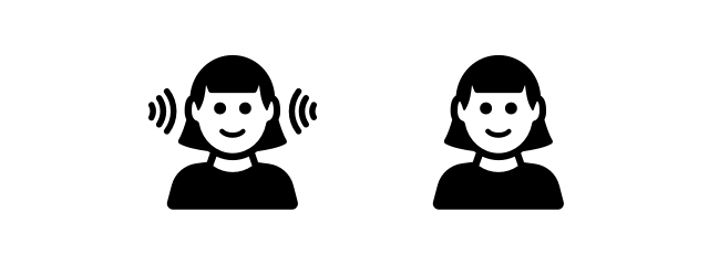
A few icons that were more literal caught our attention. Ears, avatars listening to headphones, or speech bubbles had qualities that seemed stripped down and contrary to our adult biases — worthy of exploring.
*See the hero image of this essay
☝︎

The avatars kept our attention, as they could be interpreted as the students. Would they copy the icon in a monkey-see-monkey-do fashion (i.e. icon has headphones, let's put on our headphones)?
The on/off ambiguity problem
While testing, we immediately ran into a common issue with mute icons. Does the icon show me the current status, or does it show me the action I can take?

Will my audio mute when I click this? Or am I currently muted and audio plays when I click?

Spotify has a tooltip that shows me the current state, and tells me that clicking on it will mute my audio. It also has a volume bar next to it that reinforces the state I’m in.
Products like Spotify get around this since users have immediate feedback. If music is on, it's obviously not muted. We didn't have that luxury; instructions were intermittent. Even if audio is ON, the app could be silent.
The monkey-see-monkey-do approach also introduced new confusion. Some designs made students think they were supposed to take off their headphones, and others didn’t make it clear you could mute.

Mute icons seemed to imply that students needed to take off their headphones.
This icon state (left) was fine for indicating when audio was playing, but it didn't seem like you could mute.
Introducing The friendly bigmouth
Students were reacting differently to an avatar/emoji design, so we kept exploring. Maybe the face needed to represent a helper or teacher instead of a student. It could be telling them what to do. At the end of the day, all we really wanted to communicate was that someone was talking to them.
So why not just have an icon with an actual mouth?
Icon explorations
Currently Playing: A pulsing animation brought attention to Bigmouth as it was talking and made it clear the audio was her voice.
Sound On: A gradient and shadow gave Bigmouth more weight and hinted at interactivity.
Sound Off: The X's and zippers on mouths felt strangely violent or scary for kids, whereas the sleeping Z's were clear and implied that Bigmouth wasn't going to talk.
Audio Currently Playing: The speech bubble is very recognizable
Final Design
At the end of the day, all we really wanted to communicate was that someone was talking to them.

Animation gave the mute button a level of interactivity that kids loved.
↲

Currently Playing: We incorporated the speech bubble design and the tail would appear when Bigmouth was talking.